
Example specsCheckout
Cut optional fields on the pay step
A checkout pay-step test that uses Choice Overload, Loss Aversion, and Risk Reversal so Pay is the only decision left on the screen.
Aim: Increase checkout completion by cutting optional fields
🎯 Hypothesis
- If we strip optional fields from the pay step
- By keeping only email and card, framing Pay as keeping free shipping, and putting the refund on the same row
- Will more visitors complete checkout
- Because Choice Overload removes extra decisions, Loss Aversion makes the CTA about what they keep, and Risk Reversal lowers the last hesitation
🔬 Research
Psychology / behavioural economics
- Extra options slow the decision and raise abandonment; choice overload is the leak when company, coupon, and address sit in front of the card. - source
- Losses weigh about twice equivalent gains, so loss aversion belongs in the Pay label ("Keep free shipping") rather than a generic verb. - source
Case studies
- Large checkout studies still find more fields on the pay step than people will complete; cutting optional inputs is the reliable move. - source
- GOV.UK service patterns put one job on the page so people can finish without ranking extras. - source
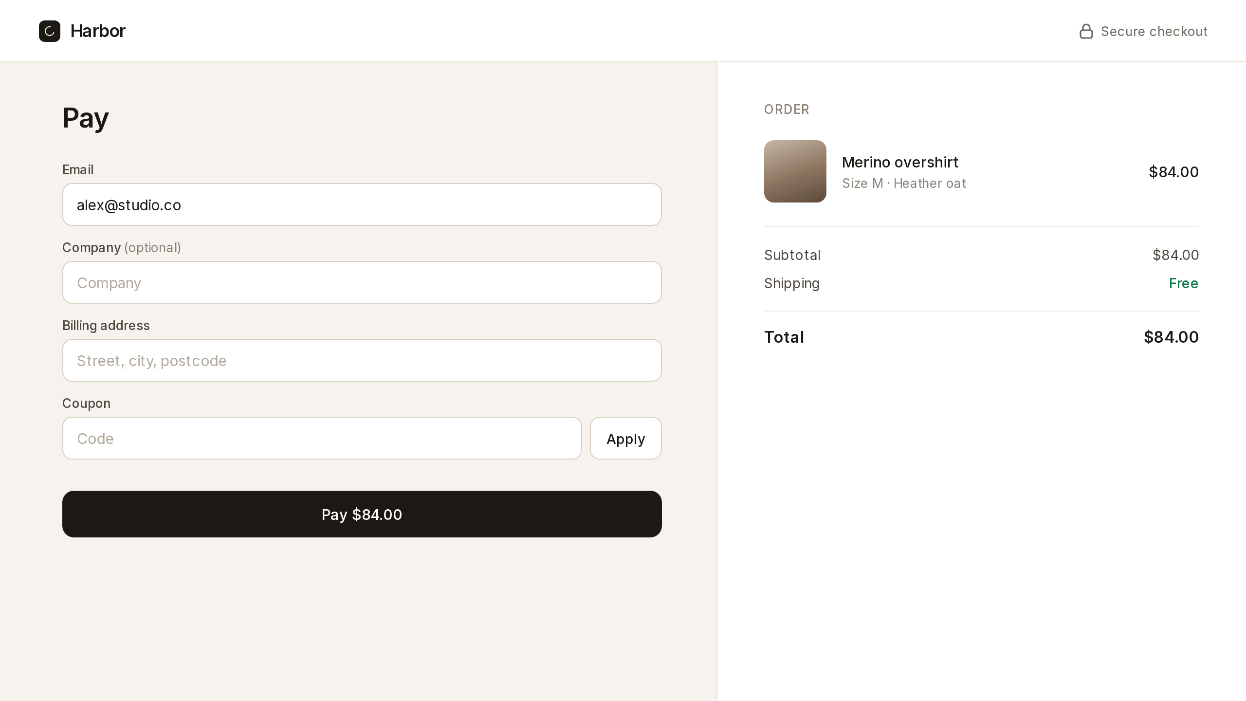
🖼️ Control
The existing UI for the pay step.
✨ Treatment
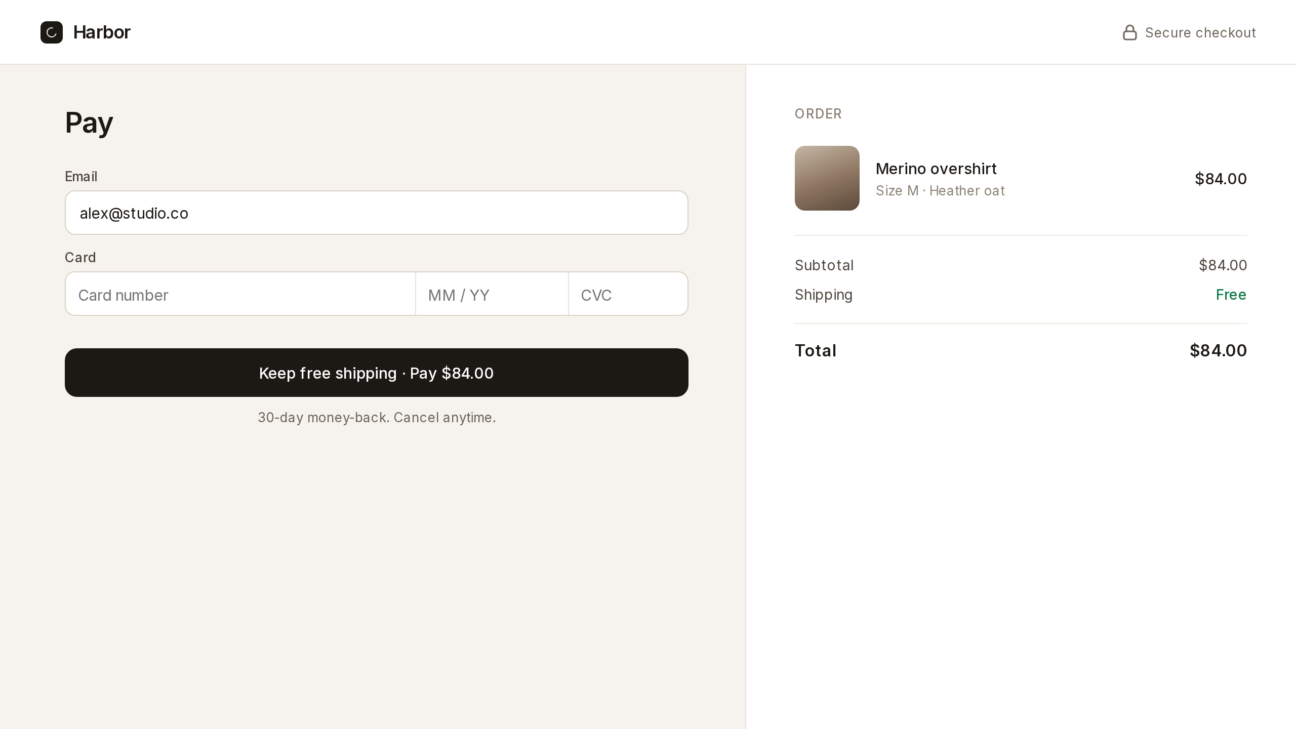
Removes company, billing address, and coupon from the pay step. Pay copy becomes "Keep free shipping · Pay $84.00", with a 30-day money-back line under the button.
<section class="pay">
  <label>Email <input type="email" value=""></label>
  <label>Card <input type="text" inputmode="numeric" value=""></label>
  <button type="button">Keep free shipping · Pay $84.00</button>
  <p>30-day money-back. Cancel anytime.</p>
</section>
.pay { max-width: 22rem; padding: 1.5rem; font: 16px/1.4 system-ui, sans-serif; }
.pay label { display: grid; gap: 0.35rem; margin: 0 0 0.85rem; font-size: 13px; color: #444; }
.pay input { height: 2.5rem; padding: 0 0.7rem; border: 1px solid #ccc; border-radius: 8px; }
.pay button { width: 100%; height: 2.75rem; border: 0; border-radius: 8px; background: #111; color: #fff; font-weight: 600; }
.pay p { margin: 0.75rem 0 0; font-size: 13px; color: #555; }
📊 Metrics
Primary metric
The deciding metric.
- Checkout completion (%) — share of pay-step visitors who successfully pay
Measurement metrics
Help explain the result.
- Time to pay (avg) — seconds from pay-step view to successful payment
- Field error rate (%) — share of pay-step visitors who see a validation error
Guardrail metrics
Must not regress during the experiment.
- Support contacts about checkout (count) — tickets tagged checkout or payment
- Refund rate (%) — share of completed orders refunded within 7 days
📈 Results
| Variant | Visitors | Conversions | Conversion rate |
|---|---|---|---|
| Control | TBD | TBD | TBD |
| Treatment | TBD | TBD | TBD |
✅ Conclusion
Variant shipped to all users? Control / treatment
MAGE
Ready-to-run experiment tickets.
Upload a screen. Get a spec written like a growth engineer would write it.
Try MAGE