
Example specsSignup
One field at a time on mobile signup
A mobile signup test that uses Choice Overload, Endowed Progress, and Risk Reversal so creating an account is one short step, then another, with a cancel-anytime note on the last screen.
Aim: Increase mobile signup completion by showing one field at a time
🎯 Hypothesis
- If we stop asking for the full account on one mobile screen
- By showing one field per step, starting a progress bar at 25%, and putting "cancel anytime" on the password step
- Will more mobile visitors finish signup
- Because Choice Overload falls when there is one input, Endowed Progress makes the remaining steps look small, and Risk Reversal answers the last "what if this is a mistake" thought
🔬 Research
Psychology / behavioural economics
- More concurrent options raise decision time and drop-off; choice overload on a signup form is four labels competing with the keyboard. - source
- A bar that already shows progress (endowed progress) beats a bar that starts empty, including on short flows. - source
Case studies
- Form usability work still finds that asking for everything at once is the usual reason mobile signups stall. - source
- GOV.UK splits long jobs into one thing per page so people can complete on a phone without ranking fields. - source
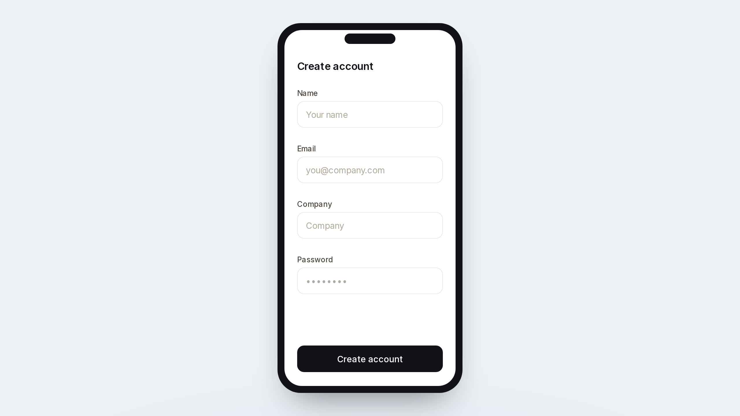
🖼️ Control
The existing UI for mobile signup.
✨ Treatment
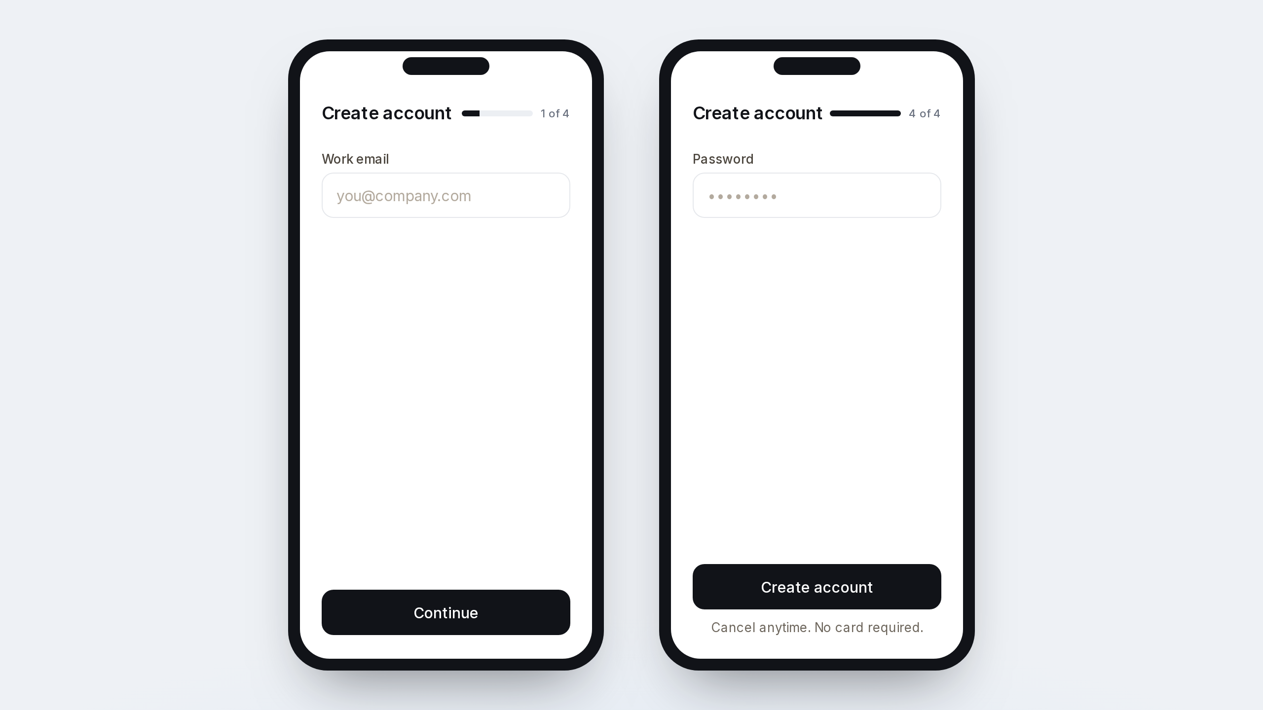
Splits signup into four single-field steps. The bar starts at 25%. The password step is the only one with the submit button, plus a cancel-anytime line.
<section class="signup">
  <header>
    <h1>Create account</h1>
    <p>1 of 4</p>
  </header>
  <progress value="25" max="100">25%</progress>
  <label>Work email <input type="email" value=""></label>
  <button type="button">Continue</button>
</section>
<section class="signup">
  <header>
    <h1>Create account</h1>
    <p>4 of 4</p>
  </header>
  <progress value="100" max="100">100%</progress>
  <label>Password <input type="password" value=""></label>
  <button type="button">Create account</button>
  <p>Cancel anytime. No card required.</p>
</section>
.signup { max-width: 20rem; padding: 1.25rem; font: 16px/1.4 system-ui, sans-serif; }
.signup header { display: flex; justify-content: space-between; align-items: baseline; }
.signup h1 { margin: 0; font-size: 1.1rem; }
.signup progress { width: 100%; margin: 0.75rem 0 1rem; }
.signup label { display: grid; gap: 0.35rem; font-size: 13px; color: #444; }
.signup input { height: 2.5rem; padding: 0 0.7rem; border: 1px solid #ccc; border-radius: 8px; }
.signup button { width: 100%; margin-top: 1rem; height: 2.6rem; border: 0; border-radius: 8px; background: #111; color: #fff; font-weight: 600; }
.signup p { margin: 0.6rem 0 0; font-size: 13px; color: #555; }
📊 Metrics
Primary metric
The deciding metric.
- Mobile signup completion (%) — share of mobile signup starters who create an account
Measurement metrics
Help explain the result.
- Step 1 to step 2 (%) — share of email-step viewers who continue
- Password-step completion (%) — share of password-step viewers who submit
Guardrail metrics
Must not regress during the experiment.
- Signup duration (p50) — median seconds from first field to success
- Invalid email rate (%) — share of attempts that fail email validation
📈 Results
| Variant | Visitors | Conversions | Conversion rate |
|---|---|---|---|
| Control | TBD | TBD | TBD |
| Treatment | TBD | TBD | TBD |
✅ Conclusion
Variant shipped to all users? Control / treatment
MAGE
Ready-to-run experiment tickets.
Upload a screen. Get a spec written like a growth engineer would write it.
Try MAGE